
Case study 05 · The Centre for Health
Every service, easy to find.
The Centre for Health in Tauranga brings science and Mātauranga Māori together for whole-person health. Its old website was clunky: people found it hard to get around, and hard to tell what the centre actually offered. We redesigned it so every service is easy to find, and easy to understand.
- Client
- The Centre for Health, Tauranga
- We built
- A full website redesign
- Built on
- Duda
- Status
- Live at thecentreforhealth.co.nz
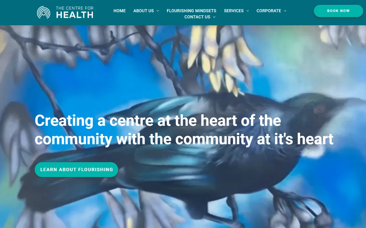
01 · Before and after
Same centre. A clearer front door.
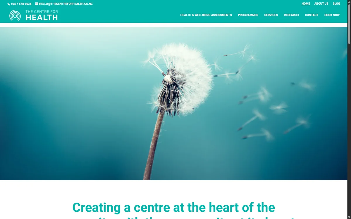
The old site opened on a dandelion and a row of three buttons. The new one opens on a mural and a clear promise, with the way in to every service right at the top.
02 · The menu
Name the services, and people find them.
The old menu had six links and named none of the services. You had to know what you wanted before you could look for it. The new menu lists every service by name, and gives the corporate programmes and the centre's story places of their own. Open them up: these are both menus as they were.
03 · The site
Scroll the real thing.
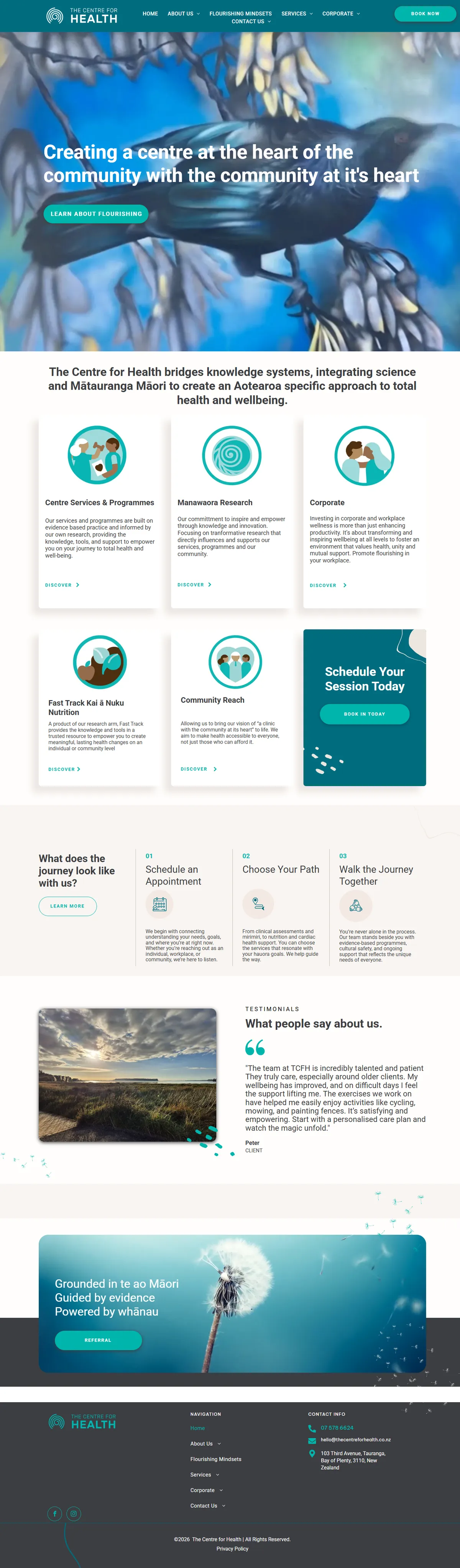
This is the live home page, top to bottom, on a desktop and on a phone. The services come first. Then a simple three-step journey: book, choose your path, and walk it together. Then the corporate and research arms, and what clients say.
Captured from thecentreforhealth.co.nz, 13 October 2026.

04 · What we built
Clear first. Then everything else.
A menu that names things
Every service has its own page and its own place in the menu, so people can see what the centre offers before they click.
A journey in three steps
Schedule an appointment, choose your path, walk the journey together. The first visit is explained before anyone has to ask.
Room for every arm
The corporate programmes and the research each have their own home, without crowding the people looking for care.
A phone layout of its own
On a phone, the services stack as cards you can tap, with booking close at hand.
05 · In their words
Website traffic grew by 235%.
After the new website and their social media were brought together. In their words:
Our existing website was difficult to navigate and wasn’t as user-friendly as we wanted it to be. We had updated information about our services but were struggling to bring everything together in a clear, simple and easy-to-use format that reflected who we are and what we offer. We knew what we wanted to achieve but needed help bringing the pieces together and turning our ideas into a website that was easy for people to navigate and understand.
Kory didn’t just take the mahi away and deliver a finished product; he brought us along for the journey. He took the time to understand what we were trying to achieve, guided us through the process and helped us make sense of all the moving pieces. What we really appreciated is Kory's approach, experience and ability to bring our vision to life - the nudges along the way were also helpful!
One of the biggest wins was aligning our social media presence with our new website. Together, these changes helped our website traffic grow by 235%.
Beyond the numbers, the new website has made it easier for people to navigate our services and understand what we offer. Kory is a trusted partner for us and thanks to his amazing mahi, we continue to work together on other projects.
Can people find the right service?
Tell us how people use your website and where they struggle. We'll explore a clearer experience around their needs.